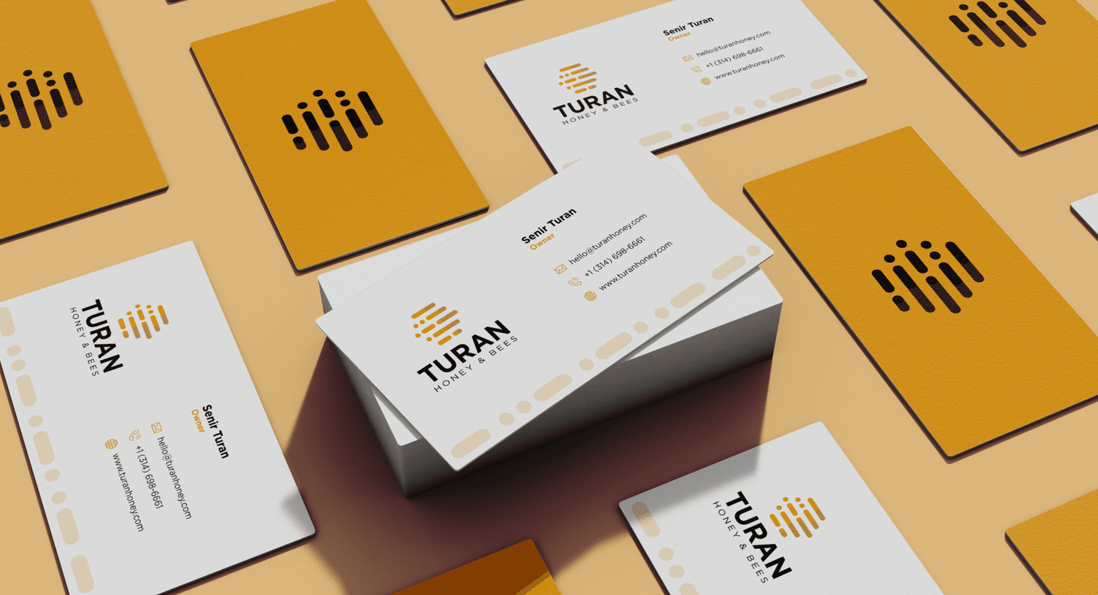
Turan Honey & Bees
What started as a shared love for nature and bees has blossomed into a thriving family-owned business dedicated to providing the local St. Louis community with the finest natural honey. Guided by their values of trust, integrity, and quality, the Turan family takes pride in every jar of honey that they make, ensuring it reflects their dedication to their craft and community.
The Brief
Turan Honey & Bees partnered with us for a full brand revamp, aiming to elevate their visual identity while staying rooted in authenticity and nature. The brief focused on developing a brand new logo, color palette, typography, and overall identity that reflected the brand’s commitment to sustainability and trust, whilst embracing aspects of modern, minimalistic design.
Our Solution
We approached Turan Honey & Bees’ rebranding by immersing ourselves into their core values of trust and community – choosing a hive, a perfect representation of both elements, to be the foundation of their logo. We then crafted a visually cohesive, minimalistic design for the icon, with a hidden element of morse code which spells out TURAN from top-to-bottom, inspired by studies that have shown honeybees being able to communicate in morse code when trained. Coupled with a color palette of hues that represent a honeybee through and through and a strong, contrasting typography, the revamp was complete and their new identity was seamlessly transitioned into the real world!

